How to design without AI Slop
You are what you admire
If you’re tired of AI spitting out the same generic slop every time you ask it to design a landing page, the fix is simpler than it looks. It starts with taste.
As a marketer, good taste is close to a mandate. Marketing is a horizontal function: you’re stitching design, copy, and math into a single campaign, and it all has to feel like one thing.
Almost ten years ago I kept a swipe file. Vintage ads, headlines I loved, layouts I’d happily steal from. I’d flip through it before starting anything new. That swipe file was the prehistoric ancestor of the taste.md file doing the rounds on X right now.
A taste.md distills what good looks like: font pairings, color, WCAG contrast, spacing, the small decisions that separate considered from generic. You can write your own if you’re a designer, or, like me, reverse-engineer designs you admire and build on top of them.
That’s the whole trick. You are what you admire, and so is an LLM. Feed it slop references and it hands you slop. Feed it taste and it finally has something better to imitate.
Walking the talk
I redesigned this site this week (here’s the changelog). The old version was a busy, sidebar-heavy blog with a blue gradient and a nudge toast. I wanted something quieter and more modern. Before, and after:
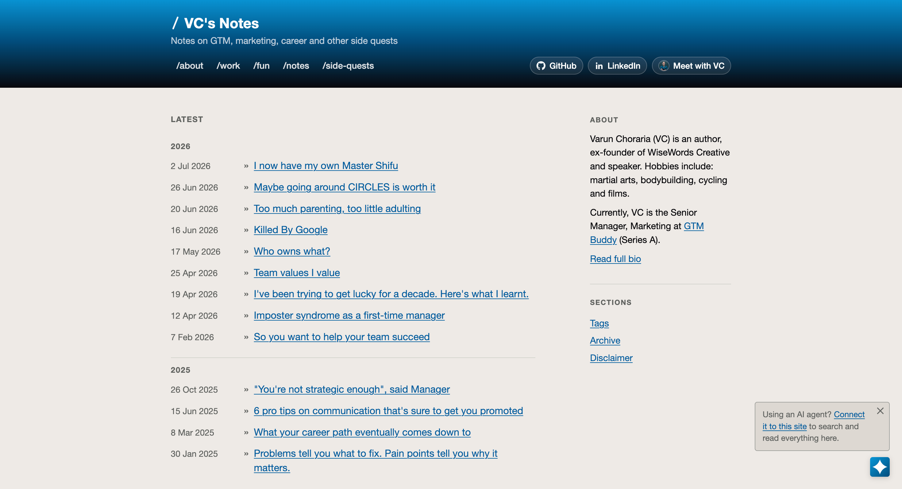
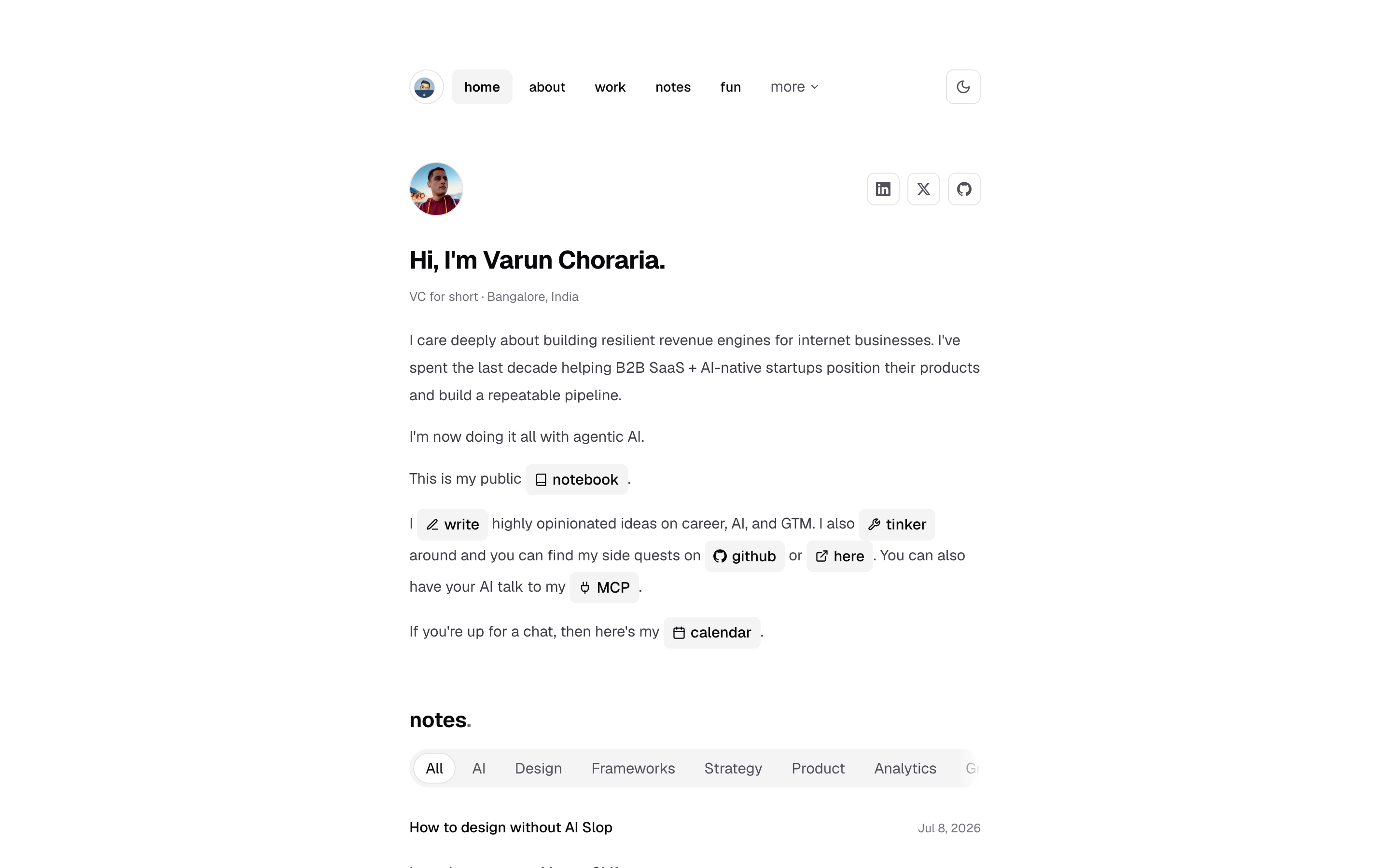
Here’s the exact process, and one you can copy.
Spin up Claude and switch to the best model. If you can’t stretch to Claude Pro, or you’d rather run something like opencode, point it at my repo, michealangelo. It’s a skill pack you install alongside your agent, not a replacement for it. It encodes UI/UX principles, web guidelines, and design psychology into guardrails, plus a design and animation vocabulary so you can give precise feedback (“the easing feels mechanical”) instead of vague feedback (“make it nicer”).
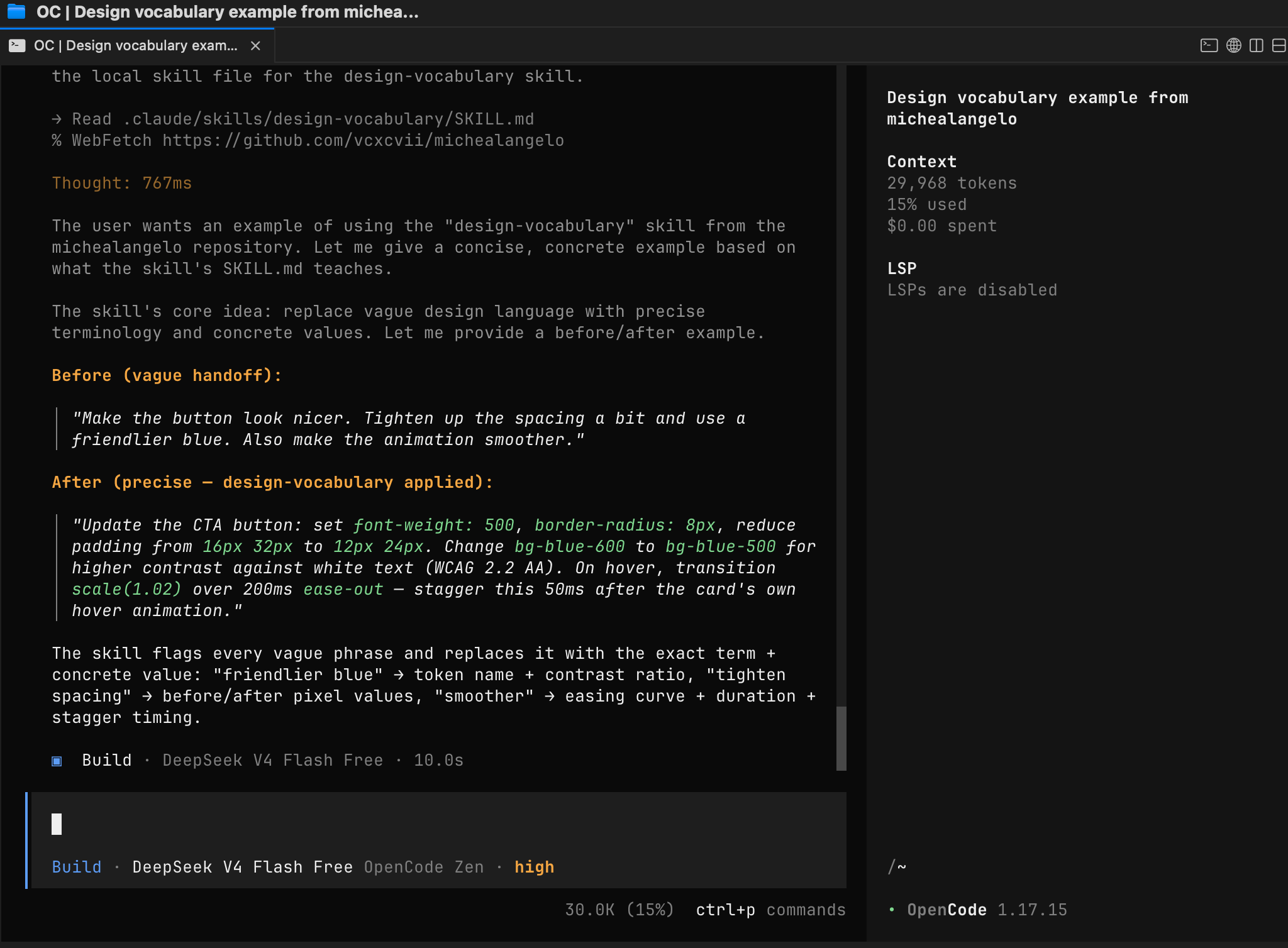
Treat it like a senior designer, not a pair of hands. A senior designer doesn’t push pixels all day. They exercise taste and judgement and direct the execution. Talk to the model that way.
Feed it what you admire. Drop in screenshots of sites you love, palettes, fonts. Ask it to build on top, then add your own flavor. I wanted shadcn components for consistency and hierarchy. They’re free and genuinely handy.
Get a written brief before anyone touches code. Ask Claude to generate a detailed design brief for whichever model will execute (I targeted Codex, then Claude Code). Annotating a live preview burns tokens fast. A brief is cheaper, and it travels between tools.
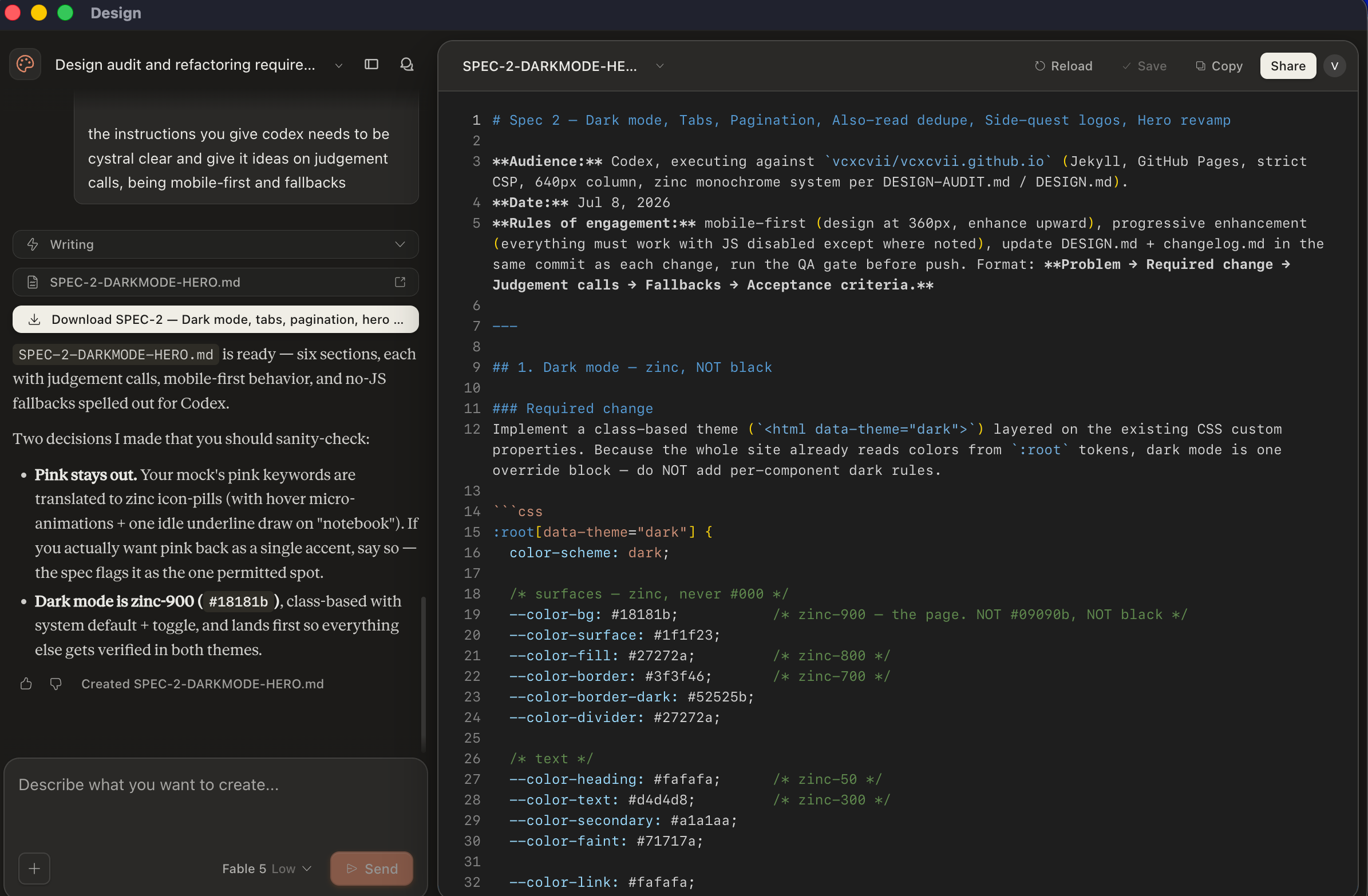
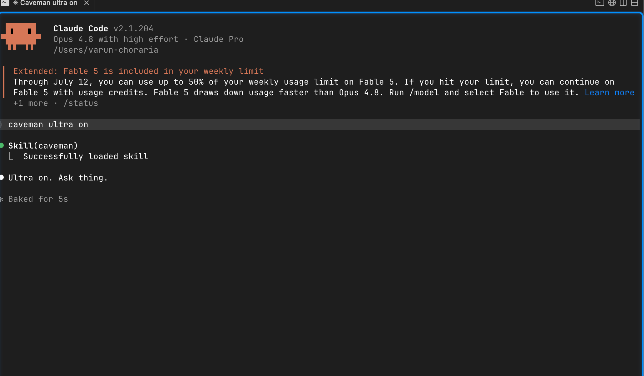
Execute in the CLI. I use Claude Code partly because caveman ultra cuts token spend by roughly 65% (measured) per session. Pick a mid-tier model on medium effort to execute, and save the frontier model for the thinking. Ship it for free on GitHub Pages, or on Vercel.
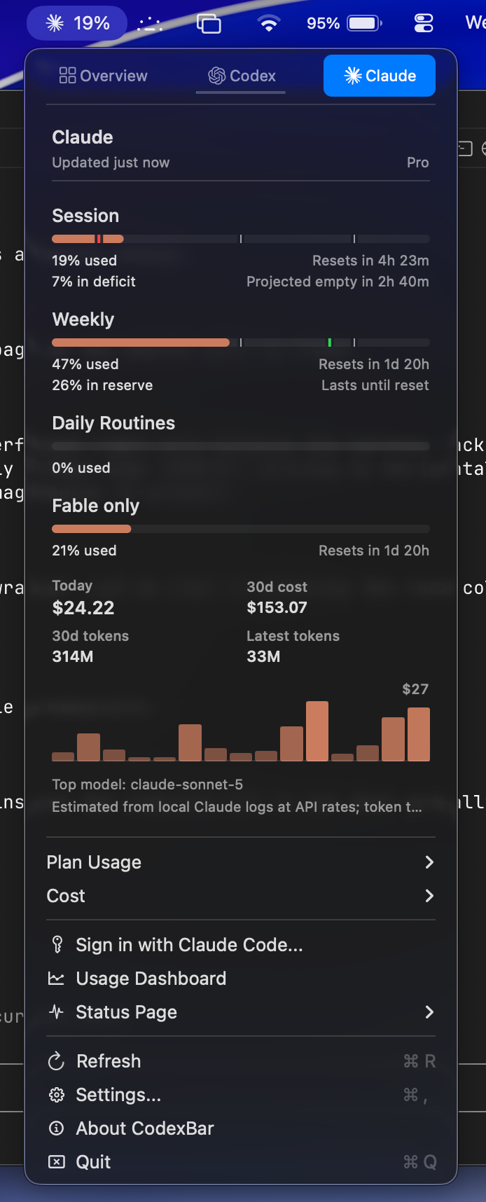
Watch your spend. Something like CodexBar keeps token usage visible. This whole update, adding an “ask any AI about me” band and restoring my RSS feed to the nav, cost about 19% of a single session.
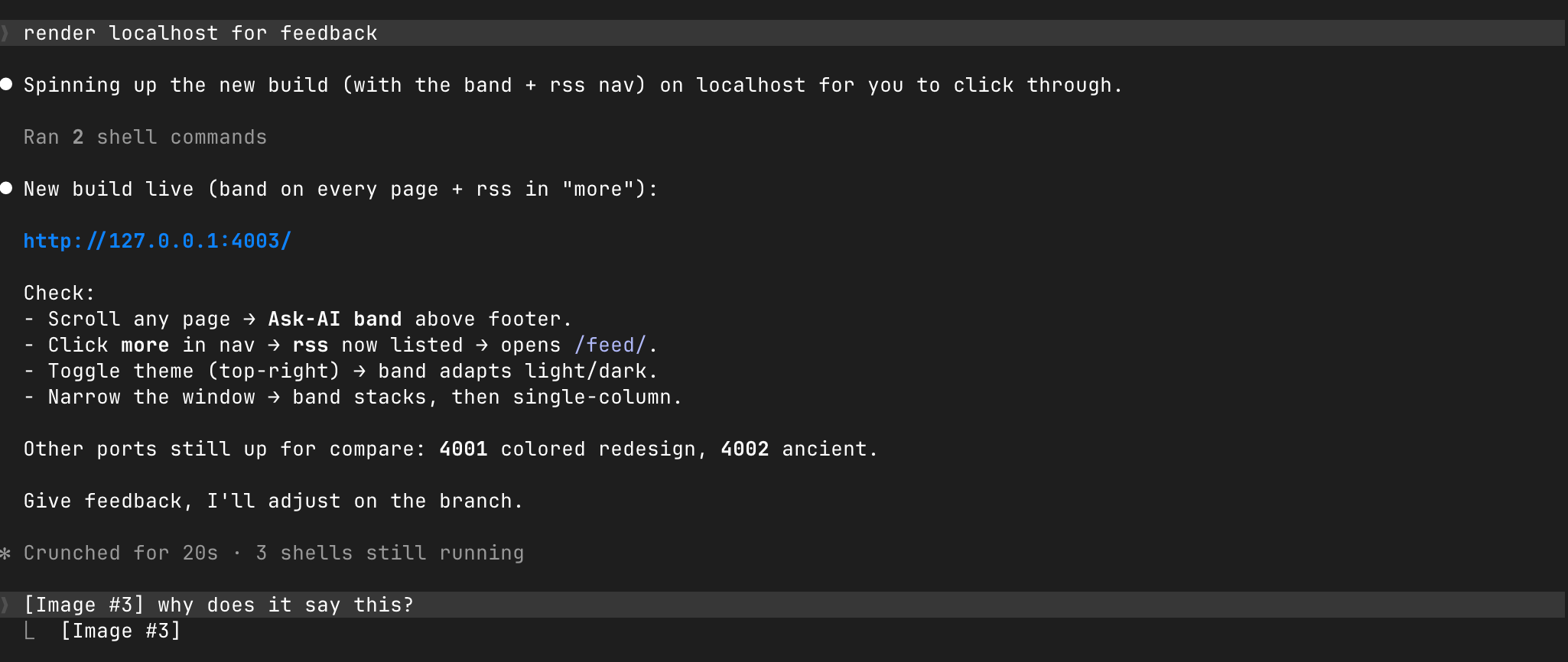
For feedback, render locally. Ask the agent to serve it on localhost. Want to compare versions? Spin up a few ports at once (I ran 4001, 4002, and 4003 side by side: ancient, colored, and the new monochrome build). Giving feedback is easy: just paste screenshots back.
The part everyone skips: enforce it
Here’s what actually kills slop, and what most “just use a taste.md” advice leaves out.
A taste.md is a suggestion. Suggestions rot. Three sessions in, an agent quietly reintroduces a stray accent color or swaps your font on a button, and you don’t notice until it’s live.
So I didn’t just document taste. I made it a rule the machine checks.
My site is now strictly monochrome: one zinc scale, and the only color left is in photographs. That decision lives in a machine-readable DESIGN.md. And a pre-push QA gate fails any commit that reintroduces a hue, a legacy class, or the wrong font on UI. If an agent, or me at 1am, tries to sneak color back in, the push is blocked before it ships.
That’s the shift: taste as a test, not a mood board. The mood board tells the model what good looks like. The test guarantees the codebase stays that way, no matter how many agents touch it after you.
Slop isn’t only a generation problem. It’s an entropy problem. Guardrails set the direction; enforcement holds the line.
So
You are what you admire, so curate what you admire, then encode it. Write the swipe file. Turn it into guardrails. Make the guardrails enforceable. Do that and the generic look doesn’t just leave, it can’t come back.
